
Results
Supplementary module example
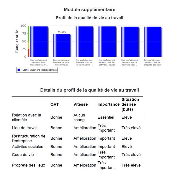
This chart is only generated when additional questions on new QWL areas are included upon the request of a company or organization (maximum of six questions). Always expressed in percentiles, the results here take the form of bars representing the QWL scores of the organization or company on each additional question. The colour bar on the vertical axis (from red to green) shows in which QWL zone each area falls.
The chart is accompanied by a table providing details of the quality of life of the organization or company. The table indicates the QWL zone in which each additional area falls and specifies whether there has been an improvement, deterioration or the absence of change, the degree of importance placed on it as well as whether there is a high or low goal attached to it.