
Results
Basic group example
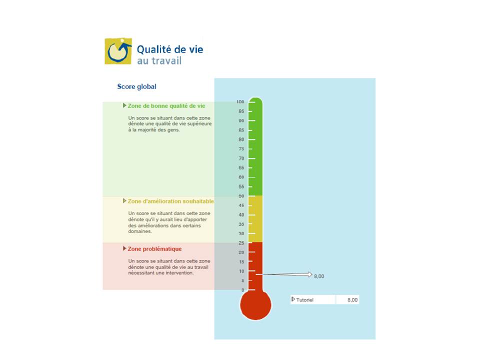
The “Global Score” measures the Quality of Working Life (QWL) of the entire company or organization. The results are expressed in percentiles, which enables the company to be ranked in relation to all the people who have taken the QWLSI to date.
A result that falls in the green zone indicates a good quality of working life. On the other hand, when a result falls in the yellow zone, there is room for improvement in certain areas. Finally, as illustrated in the example, a result which falls in the red zone should be considered problematic. In such a case, an intervention prioritizing the most problematic areas is necessary.
Profile of the quality of life by area
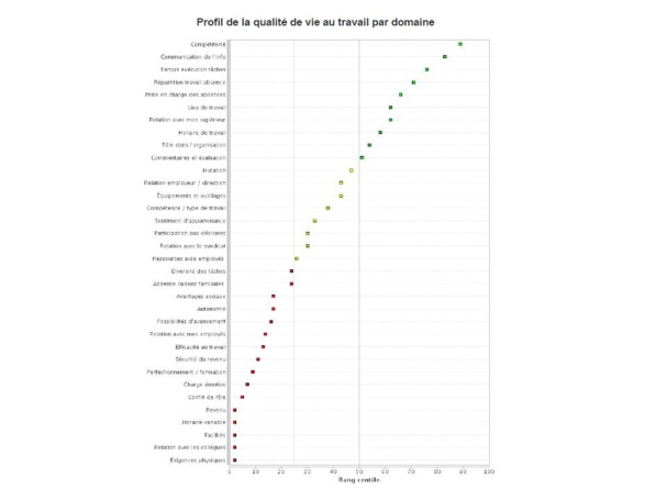
The dots on this graph represent QWL scores obtained for each area by all the respondents in the company or organization. The areas are classified by QWL scores (from highest to lowest) and the colour of the dots changes according to zone: green dots for the “good quality of working life” zone, yellow dots for the “room for improvement” zone or red dots for the problematic zone. The scale on horizontal axis of the graph is expressed in percentiles and once again enables results obtained to be compared with the results of all the people who have taken the survey to date.
Profile of desired situations
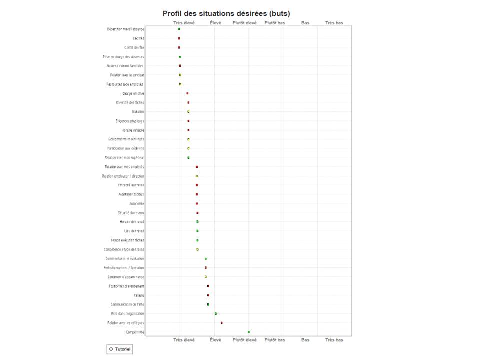
The desired situation indicates employees’ desired goals in each area of life. As the QWL is measured by the gap between the current and desired situations, it is useful to find out employees’ goal levels. When the QWL is low, the presence of high goals could be a sign of the need to develop a strategy to improve it. On the other hand, the situation requires significant changes if the QWL is low and accompanied by low goals. Please note that a good quality of working life accompanied by low goals may reveal that employees lower their expectations to avoid getting frustrated, a situation that is not very positive for the organization and employees because it may be the sign of a certain resignation and apathy.
Profile of the importance of each area
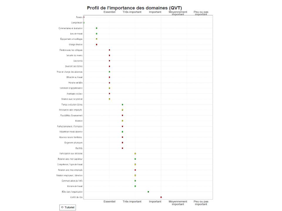
The importance placed on each area by all the employees of the company or organization is illustrated on this chart. Again, the dots follow the same “green, yellow and red” colour code. This representation enables the quick identification of priority intervention areas, that is, those identified by red dots and judged essential or very important. Too many areas in the “essential” and “very important” zones can suggest an incapacity to establish priorities. On the other hand, too many areas in the “somewhat important” and “not very important” zones can be a sign of the lack of involvement on the part of employees.
Profile of the speed of change
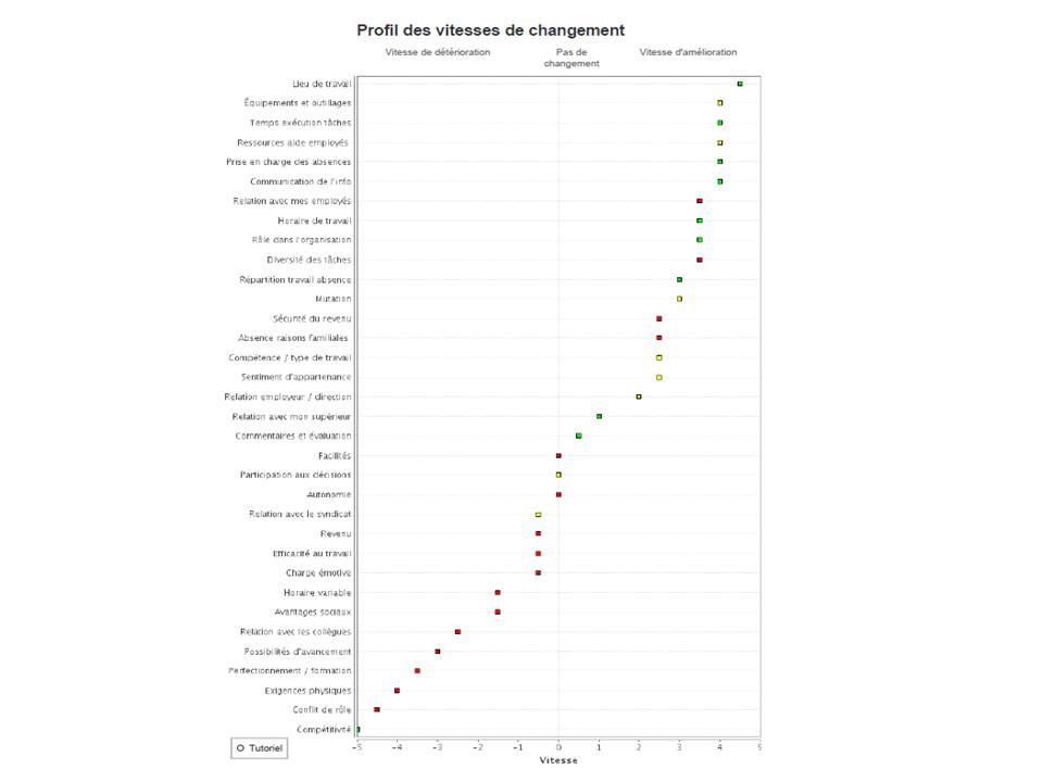
This chart takes up all the areas of working life again. This time, they are classified according to the speed of improvement or deterioration in each area, as expressed by employees. So, it enables the easy identification of deteriorating areas that need to be prioritized.
Details of the quality of working life profile
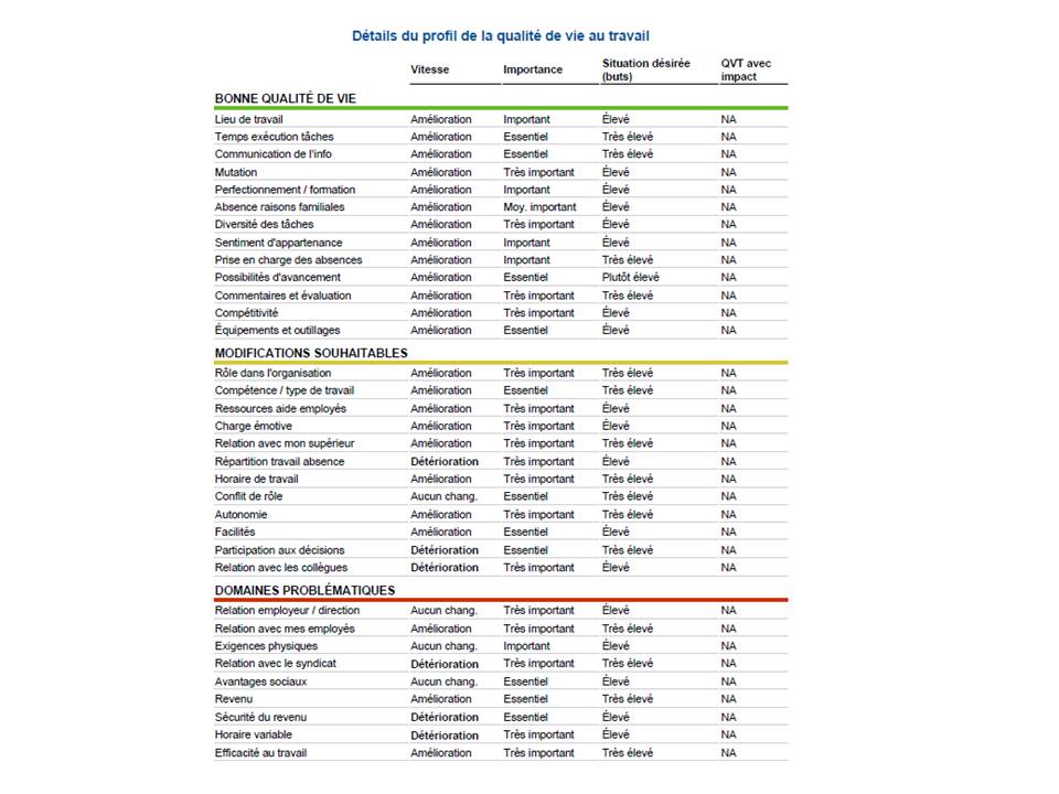
This table synthesizes the results for each area of working life, from the best to the worst, by specifying the zone into which the area falls. Whether the area is improving or deteriorating quickly, the degree of importance placed on it and whether the goal attached to it is high or low are also indicated./p>
So, the table enables an intervention plan to be quickly drafted. In terms of prevention, an area in the red zone, which is of high importance and deteriorating quickly, can be a psychosocial risk factor and should receive priority intervention quickly. On the other hand, areas in the green zone will be considered protection factors./p>